


















How to Design Mobile Learning for Field Teams
Field staff, shift workers and store teams rarely have the luxury of sitting down for training. Their device is a phone, and their spare time is measured in minutes. For these teams, mobile learning isn't a nice-to-have — it's the only format that actually reaches them, and it can't be designed as a shrunk-down version of the desktop experience.
The real constraints of field teams
For office staff, learning fits into the working day: a laptop is open, a browser tab is free, a thirty-minute module is just another item on the agenda. For field teams, the order reverses. Shifts, customers, machinery and deliveries come first — training gets squeezed into the gaps. Four constraints shape how these teams engage with learning: time, device, connectivity and physical conditions. A mobile learning strategy that doesn't address all four at once produces content nobody actually completes.
- Limited time: A break between shifts often runs five to ten minutes — a twenty-minute video simply doesn't fit.
- Shared devices: In many field settings, the tablet or phone isn't personal — it's handed between shifts and workers.
- Low bandwidth: Warehouses, tunnels, rural sites and basements have weak signal, so large files rarely finish downloading in time.
- Physical constraints: With one hand holding stock, tools or safety kit, the other has to manage the whole screen.
Micro-learning in short sessions
For field teams, the right question isn't how to shrink content — it's how much learning actually sticks in a single session. Micro-learning here isn't a trend; it's a requirement. A module should target one behaviour, take three to five minutes, and stand on its own — never depending on the one before it. Chopping a long programme into five-minute chunks isn't enough by itself; each chunk needs to deliver the one piece of knowledge a worker needs right now: a new procedure, a safety rule, a product update.
How long should a module actually be?
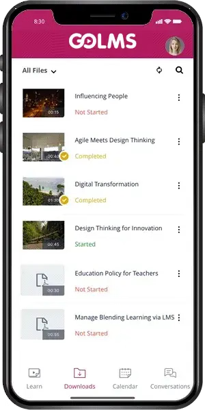
The rule is simple: design for the shortest realistic break, not the average one. Whatever time a worker can spare on the busiest day of a shift is the ceiling a module has to respect. GOLMS's mobile experience is built on this logic — every module is short, self-contained and single-topic, with progress saved automatically so a worker who steps away mid-module picks up exactly where they left off.
Offline access and low bandwidth
Training shouldn't stop where the signal does. Between warehouse aisles, in a basement, on a rural site or inside a moving vehicle, connectivity drops out. A mobile learning experience needs to plan for that: content downloaded in advance, modules completable offline, results synced automatically the moment the connection returns. This isn't just a technical feature — it's a matter of trust. No worker should have to say 'I missed the training because I had no signal.'
Designing for low bandwidth matters just as much. Images and short text instead of video, a lean interface instead of heavy animation, user-controlled downloads instead of autoplay. The GOLMS mobile app caches content in a compressed format, so a module still opens even on a weak connection.
The best mobile learning experience is the one where a worker never notices there was a connectivity problem at all.
Notifications, one-hand use and measurement
Field workers won't open a learning app on their own — they need a nudge. A short, well-timed notification, sent before a shift starts or during a break, has a direct effect on completion rates. But frequency is a design decision too: too many notifications and workers start ignoring the app altogether. The interface itself needs to work one-handed — large tap targets, swipe-based progress, minimal typing. With one hand occupied by stock or tools, a worker should be able to move through a module with a single thumb.
- Timed reminders: Short nudges sent before a shift or during a break window noticeably lift completion rates.
- One-hand design: Large tap targets and swipe-based progress are built for a worker whose other hand is occupied.
- Simple measurement: A handful of clear indicators — completion rate, correct-answer rate — give managers enough visibility without overcomplicating reporting.
Mobile learning for field teams isn't a smaller version of the desktop experience. Time, device, connectivity and physical constraints have to be designed in from the start. GOLMS's mobile experience is built around exactly these four constraints — because field teams don't adapt to training. Training adapts to field teams.